Why use Themes
- Keep pages consistent: Ensure marketing pages, dashboards, and forms all share the same colors and typography.
- Switch looks quickly: Try different presets (for example, minimal vs. playful) without rebuilding layouts.
- Share a brand system: Reuse a single theme across multiple Noah projects so everything feels on-brand.
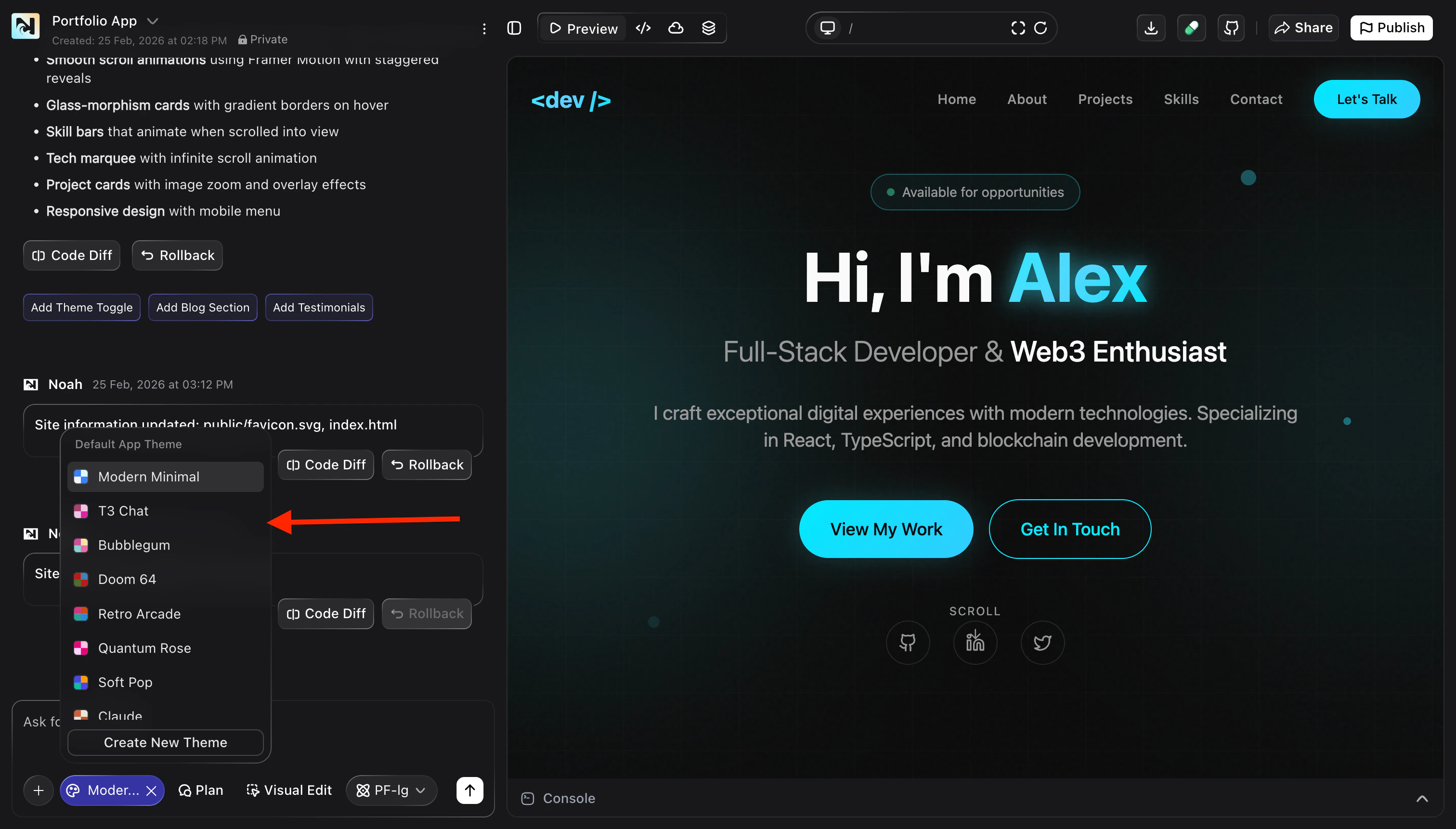
Browse and apply built-in themes
Use Themes to quickly give your project a polished starting point.Open the Themes view
In your project, open Design and switch to the Themes tab. You will see a list of available themes for your app.
Preview different themes
Hover over or select a theme from the list to see how it changes the look of
your current page — colors, typography, and UI accents update in the preview.
Create and customize your own theme
When you need something that perfectly matches your brand, create a custom theme instead of relying only on presets.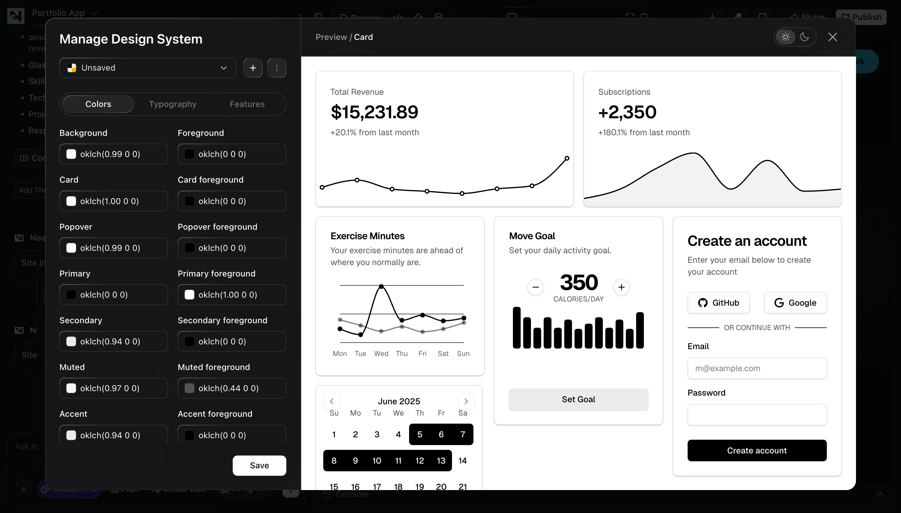
- Colors: Background, foreground, card, popover, primary, secondary, accent, and more.
- Typography: Font families, sizes, and weights for headings, body text, and labels.
- Components & features: Any additional tokens or toggles your project exposes through the design system.
Start from a base theme
In the Themes tab, pick an existing theme that is closest to your desired look and choose the option to create or duplicate it as a new theme.
Tweak design tokens
Use the editor to update color swatches, typography settings, and other design
tokens. Watch the preview panel to see how components respond to each change.
Review across key screens
Open important pages (such as the home page, dashboard, and forms) to confirm
that text remains readable and key actions stand out.
Best practices
- Check contrast: Make sure buttons and text remain legible on all backgrounds.
- Test real content: Review your theme using real copy and data, not just placeholders.
- Align with Visual Edit: Use Themes for global style decisions, then use Visual Edit for per-page adjustments.